
Book Cover Design
Book cover design has long been an area of interest for me. These projects began as a way to strengthen my editorial design skills and explore how typography, imagery, and concept can work together to tell a story. Each cover is a speculative redesign inspired by a book's themes, mood, and voice, allowing me to experiment with different visual approaches while deepening my understanding of publishing and literary design.
The Anthropocene Reviewed
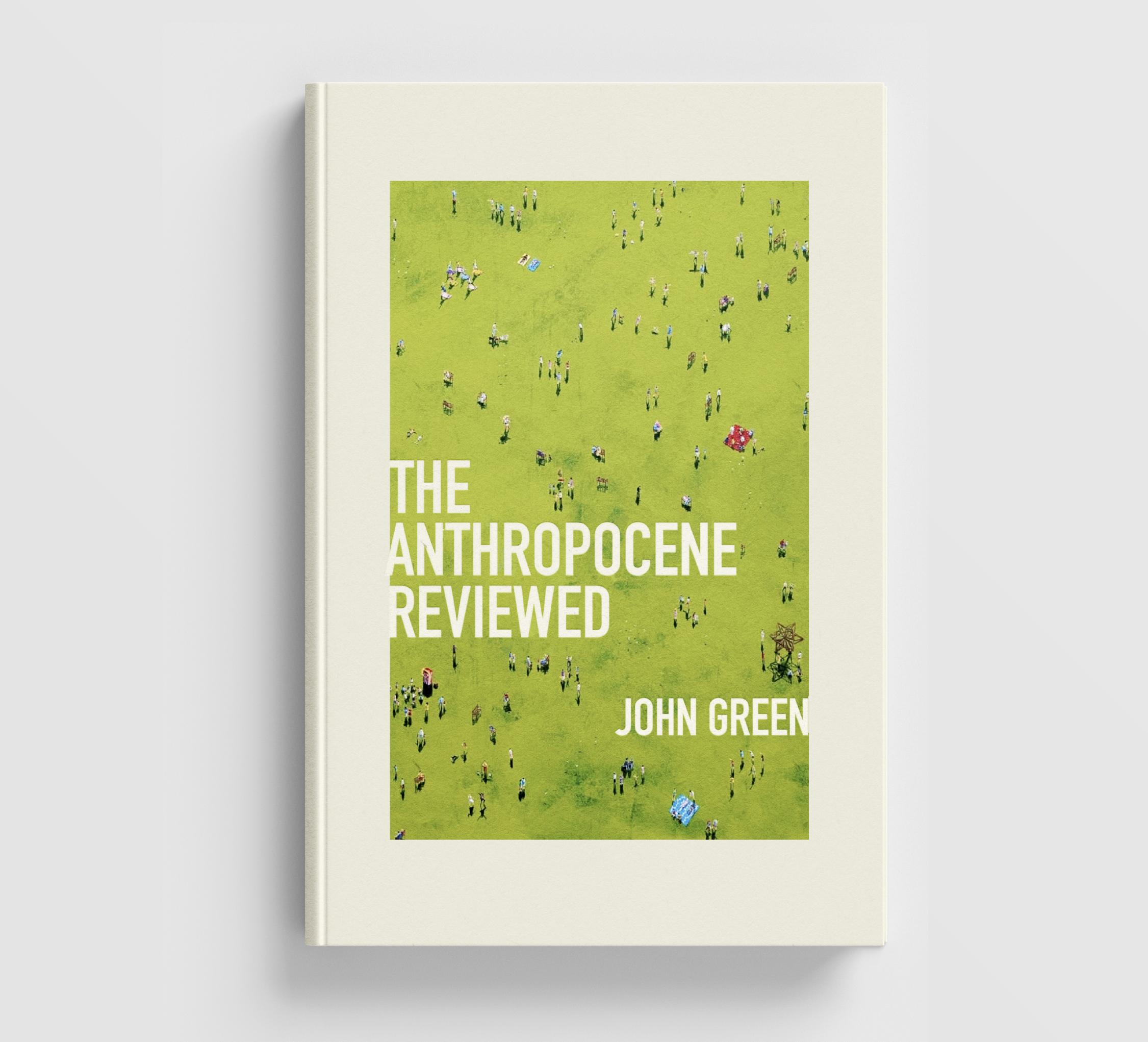
For this redesign of The Anthropocene Reviewed, I wanted to create a cover that captured one of the book's central tensions: the relationship between individual lives and the larger systems we inhabit. John Green's essays move between deeply personal observations and reflections on humanity's collective impact, so I was drawn to an image that could hold both perspectives at once.
The cover features artwork by Henry Walsh, an artist I discovered at the Affordable Art Fair in Austin, Texas. His paintings often depict groups of people viewed from a distance, reducing everyday scenes to patterns, relationships, and moments of quiet observation. Seen from above, the figures become both anonymous and deeply human.
I paired Walsh's artwork with a restrained typographic treatment that allows the image to remain the focal point. The aerial perspective reinforces the book's themes of scale, connection, and shared experience while inviting the viewer to consider how individual stories fit into a much larger picture.
Assembly
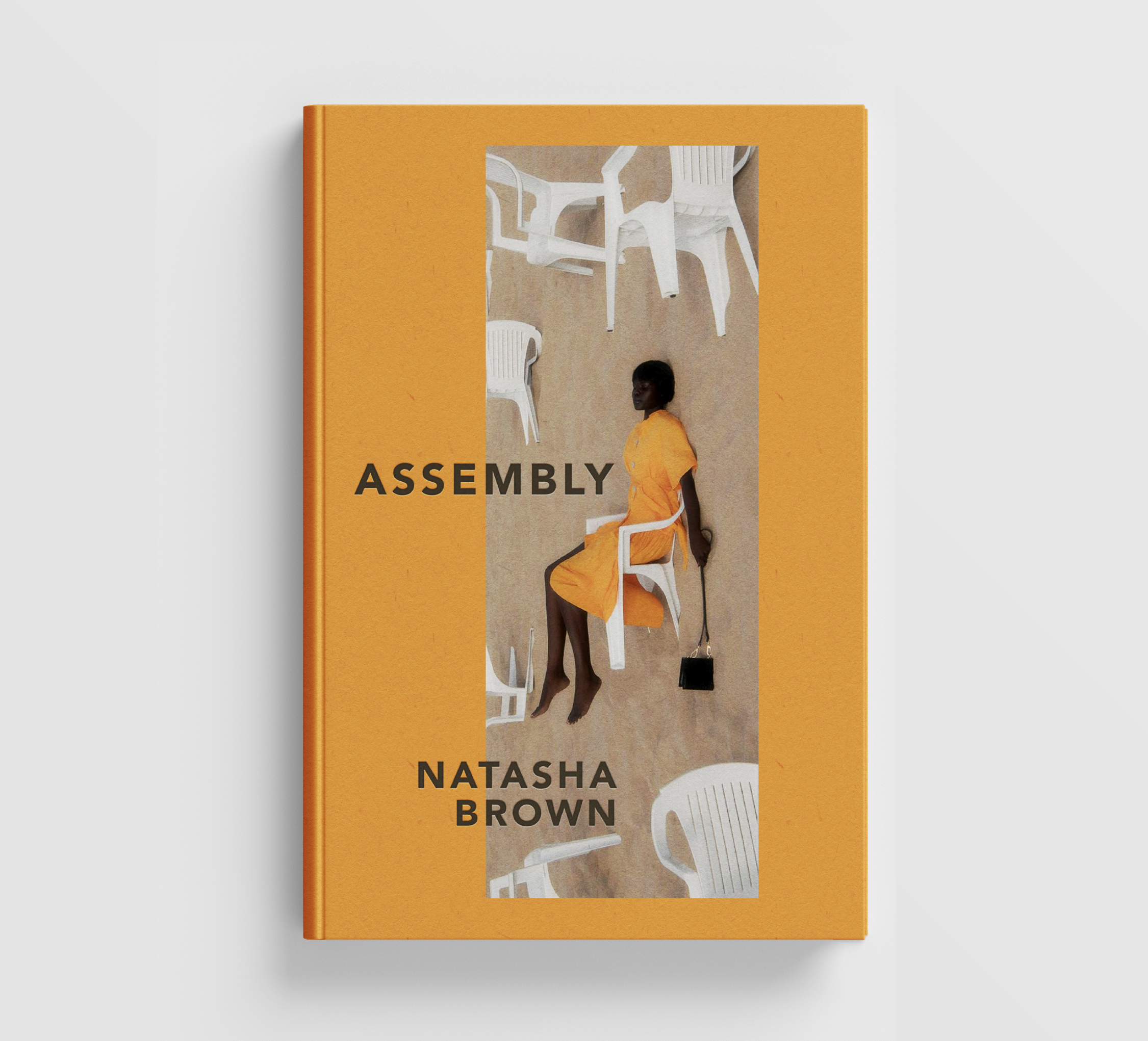
Assembly centers on a young Black British woman navigating elite professional and social spaces while wrestling with questions of identity, belonging, ambition, and self-preservation. Natasha Brown's writing exposes the tensions that exist beneath carefully maintained appearances.
The cover features a photograph by Abdulla Elmaz. I was drawn to the image's unusual perspective and the visual relationship between the seated figure and the surrounding chairs. The photograph creates a sense of isolation while also suggesting systems, expectations, and institutions. To amplify that tension, I extended the vibrant orange of the subject's dress into a bold border that surrounds the image. The border creates a feeling of both visibility and containment, reflecting the novel's exploration of race, class, and the pressure of navigating spaces where acceptance often comes at the cost of self-erasure. By allowing the figure's presence to shape the entire composition, the design reinforces the book's central questions about belonging, performance, and the structures that define who is allowed to feel at home within them. I aimed to create a cover that feels contemporary, thoughtful, and slightly unsettling, much like the novel itself.
How to Listen to Jazz
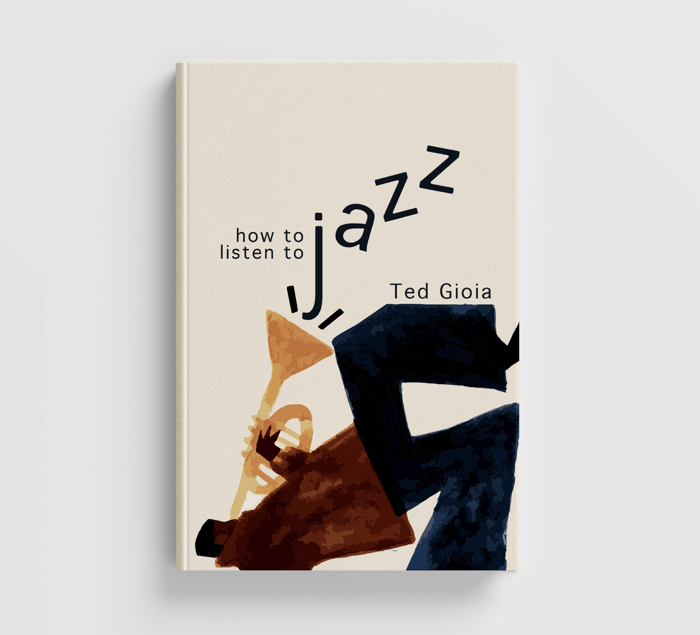
Jazz is often described as a conversation, a form built on improvisation, rhythm, and unexpected turns. For this redesign of How to Listen to Jazz, I wanted the typography and image to capture some of that energy rather than simply depicting the subject matter.
The cover pairs expressive typography with a modified illustration that I adapted specifically for this project. The title breaks away from a traditional baseline, allowing the letterforms to move across the page in a way that echoes the spontaneity and playfulness of jazz. The limited color palette and simplified forms draw inspiration from mid-century jazz posters while creating a visual language that feels approachable and contemporary.
Catalog of Unabashed Gratitude
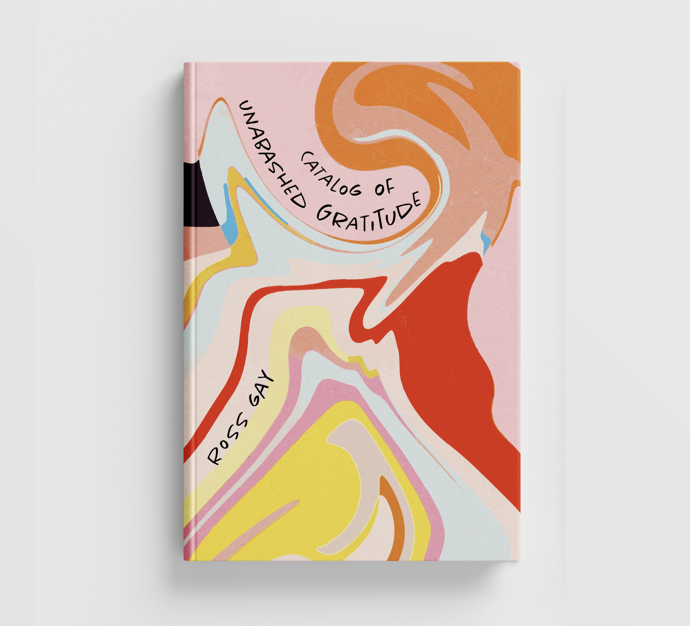
Ross Gay's Catalog of Unabashed Gratitude is a poetry collection that celebrates joy, connection, and the beauty found in everyday life. The title itself immediately suggested themes of abundance, generosity, and wonder, which became the starting point for the visual direction of the cover.
Rather than illustrating a specific poem, I developed an abstract vector composition that could evoke those ideas through color, movement, and form. The flowing shapes create a sense of energy and expansiveness, while the hand-drawn typography follows the contours of the artwork, allowing the title to become part of the composition itself. I aimed to create a cover that feels vibrant, optimistic, and deeply human, reflecting the spirit suggested by the collection's title without relying on literal imagery.